Cards
TODO:
- Discuss requirement to put it in a grid
- Mention all extras such as text-gray and text-success
Cards display information in panel form, presented inside a subtle box outline. Often they contain an image, a title, a subtitle, and body text. They can also contain buttons.
Simple text-only card
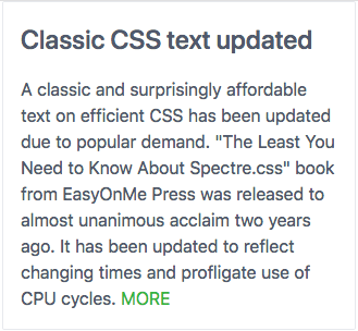
A card may contain nothing but text. Normally that would consist of a title and some sort of body text. Here’s an example:

The minimum card is wrapped inside a div of class card.
It normally has a card-header div nested inside it, and
within the card-header div is a card-title div.
Following that is a div of class card-body. Here’s an abbreviated example:
<div class="card">
	<div class="card-header">
		<div class="card-title h4">
			Title
		</div>
	</div>
	<div class="card-body">
	Body text
	</div>
</div>
Here is that same code expanded to show a more realistic presentation:
<!doctype html>
<html lang="en">
<head>

        <!-- Create title for browser tabs & Favorites -->
        <title>Text-only card example | Spectre.css</title>
        <!-- This site is responsive. Use full screen width. -->
        <meta name="viewport" content="width=device-width, initial-scale=1.0">
        <!-- Ensure use of most common Unicode characters -->
        <meta charset="utf-8">
        <link rel="stylesheet" href="https://unpkg.com/spectre.css/dist/spectre.min.css">
<style>

</style>
</head>
<body>
        <div class="container">
                <div class="columns">
                        <div class="column col-4">

                                <div class="card">
                                        <div class="card-header">
                                                <div class="card-title h4">
                                                        Classic CSS text updated
                                                </div><!-- .card-title -->
                                        </div><!--- .card-header -->
                                        <div class="card-body">
                                                A classic and surprisingly affordable
                                                text on efficient CSS has been updated
                                                due to popular demand.

                                                "The Least You Need to Know About Spectre.css" book
                                                from EasyOnMe Press was released to almost
                                                unanimous acclaim two years ago. It has
                                                been updated to reflect changing times
                                                and profligate use of CPU cycles.

                                                <a href="#"><span class="text-success">MORE</a>

                                        </div><!-- .card-body -->
                                </div><!-- .card -->

                        </div>
                </div>
        </div><!-- .container -->
</body>
Note
Note that along with the card-title style an h4 style is used.
By default card titles have no distinguishing characteristics.
That’s a good time to use the inline h4 style, which preserves
the visual characteristics of an <h4> header but without forcing a line break.
Adding a subtitle to a card
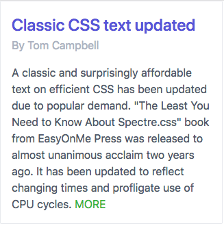
This next example is similar. It adds a card-subtitle div and uses the
inline h4 style. Experiment with others such as h1 or h3.
Here’s the a screen shot:

Here’s an excerpt from the code:
<div class="card">
        <div class="card-header">
                <div class="card-title h4">
                        <span class="text-primary">
                                Classic CSS text updated
                        </span>
                </div>
                <div class="card-subtitle text-gray">
                        By Tom Campbell
                </div>
        </div>
        <div class="card-body">
                A classic and surprisingly affordable
                text on efficient CSS has been updated
                due to popular demand.

                "The Least You Need to Know About Spectre.css" book
                from EasyOnMe Press was released to almost
                unanimous acclaim two years ago. It has
                been updated to reflect changing times
                and profligate use of CPU cycles.

                <a href="#"><span class="text-success">MORE</a>

        </div>
</div>
Simple card with image
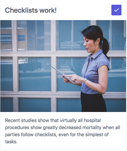
Cards come into their own when they house images. Take a look at this simple example showing a card with an image on top, a title, and some body text.

To add an image just add a div of class card-image anywhere
inside the card div. Here’s some skeletal example code:
<div class="card">
        <div class="card-image">
                <img src="images/example.jpg" class="img-responsive">
        </div>
        <div class="card-header">
                <div class="card-title h4">
                </div>
        </div>
        <div class="card-body">
        </div>
</div>
Here is a complete code listing with a sample image and typical text.
<!doctype html>
<html lang="en">
<head>

	<!-- Create title for browser tabs & Favorites -->
	<title>Card with image on top | Spectre.css</title>
	<!-- This site is responsive. Use full screen width. -->
	<meta name="viewport" content="width=device-width, initial-scale=1.0">
	<!-- Ensure use of most common Unicode characters -->
	<meta charset="utf-8">
	<link rel="stylesheet" href="https://unpkg.com/spectre.css/dist/spectre.min.css">
<style>

</style>
</head>
<body>
	<div class="container">
		<div class="columns">
			<div class="column col-4">

				<div class="card">
					<div class="card-image">
						<img src="images/person-801823_640.jpg"  class="img-responsive">
					</div>
					<div class="card-header">
						<div class="card-title h4">
							Checklists work!
						</div>
					</div>
					<div class="card-body">
						Recent studies show that
						virtually all hospital procedures
						show greatly decreased mortality
						when all parties follow
						checklists, even for the
						simplest of tasks.
					</div>
				</div>

			</div>
		</div>
	</div><!-- .container -->
</body>
Simple card with image and float-right icon
One neat example of the float-right class in the Spectre.css documentation is adding an icon
to the right of text or headline, like this:

Here’s the relevant code:
<div class="card">
	<div class="card-header">
		<button class="btn btn-primary float-right"><i class="icon icon-check"></i></button>
		<div class="card-title h4">
			Checklists work!
		</div>
	</div>
	<div class="card-image">
		<img src="assets/images/person-801823_640.jpg"  class="img-responsive">
	</div>
	<div class="card-body">
		Recent studies show that
		virtually all hospital procedures
		show greatly decreased mortality
		when all parties follow
		checklists, even for the
		simplest of tasks.
	</div>
</div>
The complete listing:
<!doctype html>
<html lang="en">
<head>

	<!-- Create title for browser tabs & Favorites -->
	<title>Card with image on top, float-right check icon | Spectre.css</title>
	<!-- This site is responsive. Use full screen width. -->
	<meta name="viewport" content="width=device-width, initial-scale=1.0">
	<!-- Ensure use of most common Unicode characters -->
	<meta charset="utf-8">
	<link rel="stylesheet" href="https://unpkg.com/spectre.css/dist/spectre.min.css">
	<link rel="stylesheet" href="https://unpkg.com/spectre.css/dist/spectre-icons.min.css">
<style>

</style>
</head>
<body>
	<div class="container">
		<div class="columns">
			<div class="column col-4">

				<div class="card">
					<div class="card-header">
						<button class="btn btn-primary float-right"><i class="icon icon-check"></i></button>
						<div class="card-title h4">
							Checklists work!
						</div>
					</div>
					<div class="card-image">
						<img src="assets/images/person-801823_640.jpg"  class="img-responsive">
					</div>
					<div class="card-body">
						Recent studies show that
						virtually all hospital procedures
						show greatly decreased mortality
						when all parties follow
						checklists, even for the
						simplest of tasks.
					</div>
				</div>

			</div>
		</div>
	</div><!-- .container -->
</body>
Reference
- SCSS source for the Spectre.css cards implementation
- Spectre.css documentation for cards
- Full spectre.css style sheet on GitHub