The grid model
A grid is enclosed in a div of type “container”
A grid must be inside a div of type container:
<div class="container">
</div><!-- .container -->
Each row is enclosed in a div of class “columns”
A grid is made up of rows. Each row is a div designated,
sadly, with the term columns, which it seems to me
should actually be called row, but isn’t.
Here’s a grid with a single row.
It is of course 12 units wide:
<div class="container">
	<div class="columns">
		<h1>Row 1</h1>
	</div><!-- .columns -->
</div><!--  .container -->
To add a row, insert another div of type “columns” at peer level, within the “container” div:
<div class="container">
	<div class="columns">
		<h1>Row 1</h1>
	</div><!-- .columns -->
	<div class="columns">
		<h1>Row 2</h1>
	</div><!-- .columns -->
</div><!--  .container -->
A grid has 12 columns
A grid is made up of 12 equidistant columns.
These columns expand to fill the container div
that encloses them.
You can designate a column div with a column width.
If it’s given the name col-1 the div is 1/12 of the grid wide.
If it’s given the name col-6 the div is half the width of the grid,
and col-12 means full grid width.
Here’s the skeleton of a blog page template that fills 4 columns on the left for a sidebar, and 8 columns to the right for the client (article) area of the blog.
<div class="container">
	<div class="columns">

		<!-- LEFT COLUMN -->
		<div class="column col-4"
			<h3>Notes</h3>
			<h4>From the edge</h4>
		</div><!-- .column .col-4 -->

		<!-- RIGHT COLUMN-CLIENT AREA -->
		<div class="column col-8">
			<h1>Welcome, my friends.</h1>
			<h2>Dramatic, simple 2-column</h2>
			<p>hello, world.</p>
		</div><!-- .column .col-8  -->

	</div><!-- .columns -->
</div><!-- .container  -->
Let’s take a look at that skeleton filled out for real-world use:
<!doctype html>
<html lang="en">
<head>
<!-- Create title for browser tabs & Favorites -->
<title>2col-blog template | Spectre.css</title>
<!-- Notify browsers this page is in Unicode -->
<meta charset="utf-8">
<!-- This site is responsive. Use full screen width. -->
<meta name="viewport" content="width=device-width, initial-scale=1.0">
<meta name="description" content="2 column blog template">
<meta name="keywords" content="spectre.css, blog, 2 columns, template">
<link rel="stylesheet" href="https://unpkg.com/spectre.css/dist/spectre.min.css">
<link rel="stylesheet" href="https://unpkg.com/spectre.css/dist/spectre-icons.min.css">
<style>
p { font-size: 1.5em;}
h1 { font-size: 3em; }
h3 { font-size: 2rem; line-height: 1em; margin-bottom: 0; }
h1, h3 { font-weight: 700; }
h4 { margin-bottom: 0;}
.titlecol { height: 100vh; }
</style>
</head>
<body>
<div class="container">
<div class="columns">
<!-- LEFT COLUMN -->
<div class="column col-4 col-sm-12 float-right bg-dark text-light titlecol"
style="padding-top: 20%; padding-left: 2em; padding-right: 2em;";>
<h3><i class="icon icon-message text-success"></i></h3>
<div class="divider" style="padding-top: 1em;"></div>
<h3>Notes</h3>
<h4>From the edge</h4>
</div><!-- .column .col-4 .col-sm-12 -->
<!-- RIGHT COLUMN-CLIENT AREA -->
<div class="column col-8 col-sm-12 float-left"
style="padding-top: 20%; padding-left: 2em;">
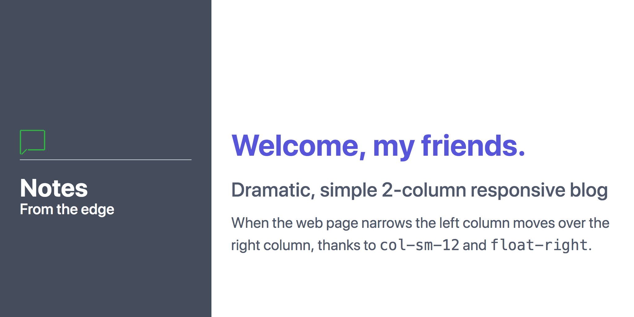
<h1 class="text-primary">Welcome, my friends.</h1>
<h2>Dramatic, simple 2-column responsive blog</h2>
<p>When the web page narrows the left column
moves over the right column, thanks
to <samp>col-sm-12</samp>
and <samp>float-right</samp>.</p>
</div><!-- .column .col-8 .col-sm-12 -->
</div><!-- .columns -->
</div><!-- .container -->
</body>
Here’s the resulting web page:
File 2col-blog.html GitHub Source,
Preview
Nested grids
Grids can be nested. Let’s create this infographic:
It consists of three rows: the header, the bottom, and the client area showing most of the text. See the margin on each side? It’s 3 blank columns. So the client area is 6 columns wide, with 3 columns of nothingness on each side.
Note that the client area has 3 columns.
Step 1: Start with a 3-column, one row header
<div class="container">
	<!-- The top "cap" with the h1 in it -->
	<div class="columns">

		<div class="column col-3">
		</div>

		<div class="column col-6">
			<h1>Top-level header</h1>
		</div>

		<div class="column col-3">
		</div>

	</div><!-- .columns -->
</div><!--  .container -->
Step 2: Add a single-row footer
<div class="container">
	<!-- The top "cap" with the h1 in it -->
	<div class="columns">

		<div class="column col-3">
		</div>

		<div class="column col-6">
			<h1>Top-level header</h1>
		</div>

		<div class="column col-3">
		</div>

	</div><!-- .columns -->

	<!-- Bottom footer-like "cap" under the 3 columns -->
	<div class="columns">

		<div class="column col-3">
		</div>

		<div class="column col-6">
			<p>Bottom panel for <a href="https://spectrebook.com">EXAMPLE.COM</a></p>
		</div>

		<div class="column col-3">
		</div>
	</div><!-- .columns -->

</div><!--  .container -->
Place a nested grid between the header and footer.
<div class="container">
	<!-- The top "cap" with the h1 in it -->
	<div class="columns">

		<!-- hide-lg makes the left column disappear when width is decreased -->
		<div class="column col-3">
		</div>

		<div class="column col-6">
			<h1>Top-level header</h1>
		</div>

		<div class="column col-3">
		</div>
	</div><!-- .columns -->

	<!-- 3 columns under the top cap -->
	<div class="columns">
		<div class="column col-3">
		</div>

		<div class="column col-6">
			<div class="columns">
				<div class="column col-4">
					<h2>Left column</h2>
					<p>Line 1</p>
				</div><!-- .column .col-4 -->

				<div class="column col-4">
					<h2>Middle column</h2>
					<p>Line 1</p>
				</div><!-- .column .col-4 -->

				<div class="column col-4">
					<h2>Right column</h2>
					<p>Line 1</p>
				</div>
			</div><!-- .columns -->
		</div><!-- .column .col-12 -->

		<div class="column col-3">
		</div>

	</div><!-- .columns -->

	<!-- Bottom footer-like "cap" under the 3 columns -->
	<div class="columns">

		<div class="column col-3">
		</div>

		<div class="column col-6 ">
			<p>Bottom panel for <a href="https://spectrebook.com">EXAMPLE.COM</a></p>
		</div>

		<div class="column col-3">
		</div>
	</div><!-- .columns -->

</div><!--  .container -->